Fresh Cart
Fresh Cart is a fictional organization that handles redistribution of excess fresh produce. It allows citizens with excess produce to donate to people in food deserts. There are many fortunate people that have access to fresh produce yet so much of it goes to waste each year. The goal of Fresh Cart is to change that. The application created for this project has two main task flows. One is for users interested in donating produce. The other is for users looking to acquire produce.
Competitive Analysis
There are several companies that already collect food from stores or cook food themselves to redistribute to those in need. However, many companies look to big grocery stores for supplying the food that will go to those in need. This process overlooks small, local farms or citizens who may have food to spare. In addition, all of these companies function as charities. The goal of Fresh Cart is to create a solution that allowed locals to give back to their community and utilize a “give what you can” shopping experience for those seeking food.
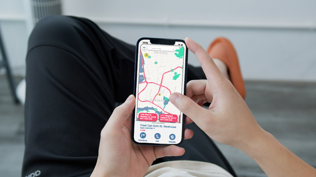
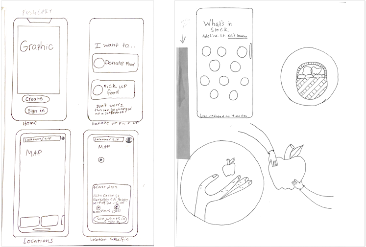
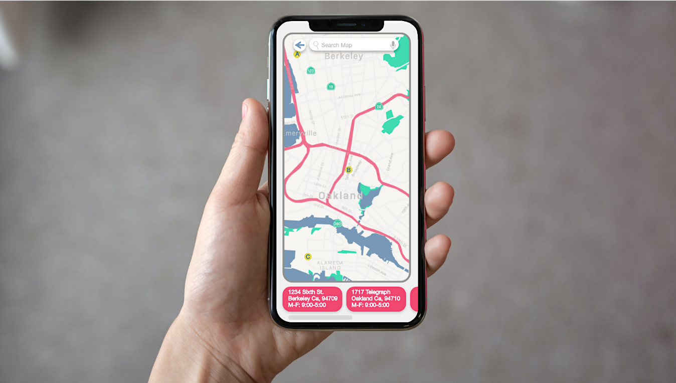
Users interested in donating food have several options regarding how the produce is collected from them. They are able to look up the location of Fresh Cart collection facilities in the app or request a pickup from a location of their choice. Users interested in acquiring produce are able to search for Fresh Cart stands close to them. They are then able to map directions to a cart, see what produce is available that day, or call with any questions.
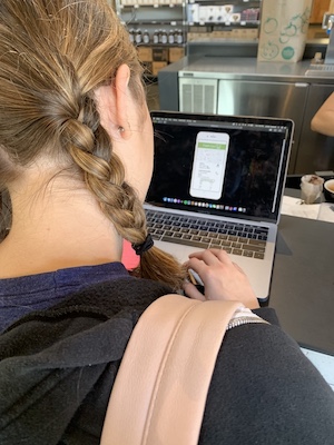
Usability Testing
"All of these buttons look the same and therefore it’s difficult to tell where I should be looking. What is the most important feature on this page? Where should my eye go?"
Do I need to bring anything with me if I’d like to pick up produce? Is there anything I’d need to know ahead of time?
What can I do if I want to go to the homepage without having to click backwards through each page?
Is there a way for me to see the all Fresh Cart locations in my area on a map rather than a list?
- All buttons were the same size in early iterations. Users reported not knowing what the main call to action was because there was no visual hierarchy to guide them.
- In the initial version of the Fresh Cart app, there was no home button. Users were required to press a “back” button many times to reach the home page. Test participants were bothered that they had to do this to get to the home screen.
- Initially, the only way to view various Fresh Cart produce stands or collections facilities was via a list of locations in the app. Users reported that they would also like to see a map with the locations so that they could see where they were in relation to the destination.
Recipient User Flow
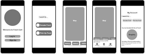
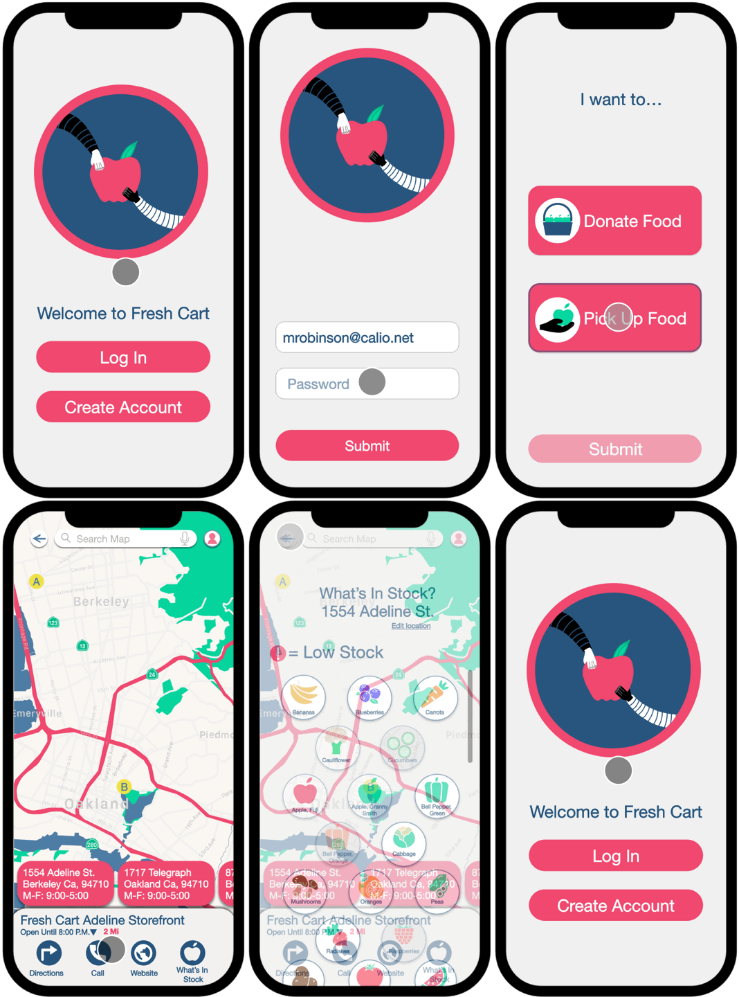
This animation shows how a user interested in aquiring produce would navigate through the Fresh Cart app. Users are able to input their location to see produce carts are near them. They are able to get directions, visit the Fresh Cart website, call the produce cart, and see what is in stock at that specific location. On the user account screen, they are able to input which cart they prefer. They are also able to switch their account so that it functions as a donor account rather than a recipient account.
Donor User Flow
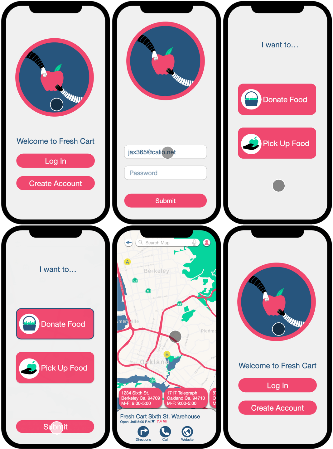
This animation shows how a user interested in donating produce would navigate through the Fresh Cart app. Users are able to input their location to see collection facilities are near them. They are able to get directions, visit the Fresh Cart website, and call the facility. On the user account screen, they are able to switch their account so that it functions as a recipient account rather than a donor account if they are in need of Fresh Cart's services.
